Music
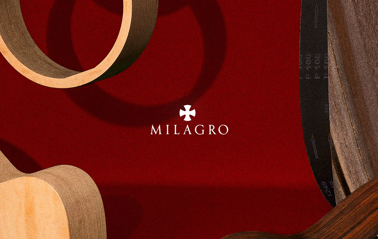
Milagro
Heavenly Sound, Earthly Engineering.
Brand Strategy | Naming | Visual Identity | Product Design
Collaboration with Jordi Belil
One of the most prestigious design and art publishing houses in the world, driven by its constant pursuit of excellence, developed its own technologies to produce musical instruments. As a result of the creation of new combined materials refined through acoustic engineering, it succeeded in producing unique sounds capable of conveying and evoking emotions with unprecedented depth.
Due to this sonic revolution, it became essential to craft a brand that reflected both the innovation and the heritage of the publishing house. In collaboration with Jordi Belil, we developed a strategy that highlighted their value concept, followed by the creation of a name and identity that remained true to their essence. Finally, we collaborated with the luthiers to apply the identity to the innovative, handcrafted instruments, ensuring a harmonious integration.

A Brand that Illuminates
A miracle is something that challenges what we know, something that seems impossible until it happens. The name reflects the meticulous work of luthiers to create unprecedented sounds, capable of exalting unique senses and taking the listener to a sensory paradise.
What’s more, Milagro has an elegant and evocative sound, easy to remember and rich with universal symbolism, making it the perfect choice for a brand that redefines the boundaries of music and craftsmanship.
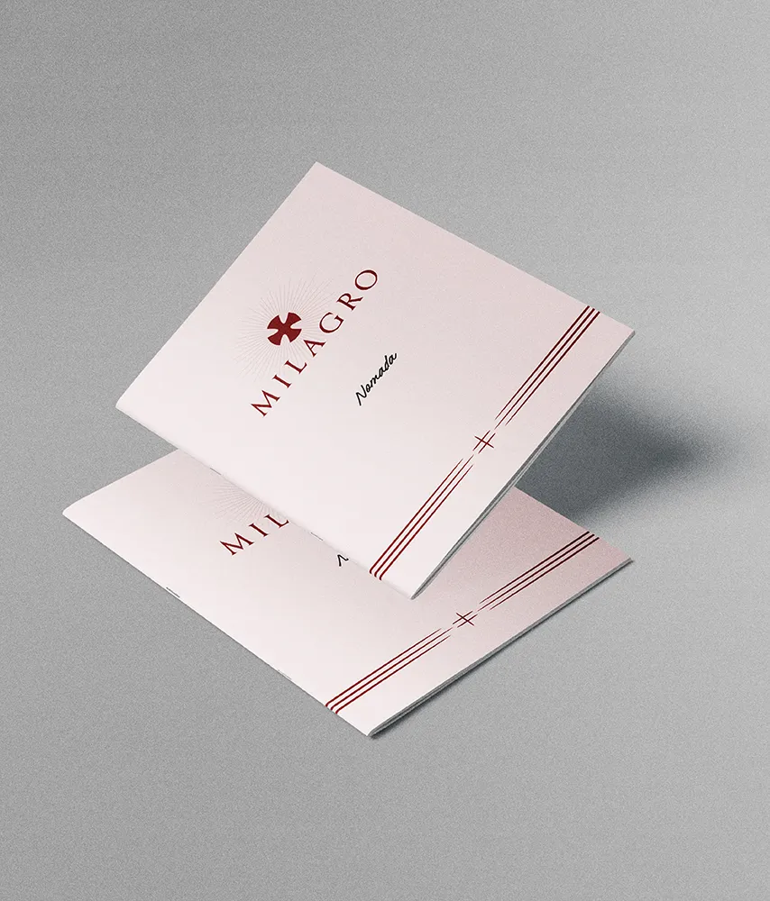
The visual identity reinforces and strengthens this idea through a serif typeface evokes the roots of the word Milagro. Alongside the typeface, the visual system includes illustrations that highlight the brand’s unique character, inspired by the mystique of miracles and the expression of handwritten texts. This approach creates a visual atmosphere that not only conveys the wonder and beauty of sound but also invites curiosity and reflection.


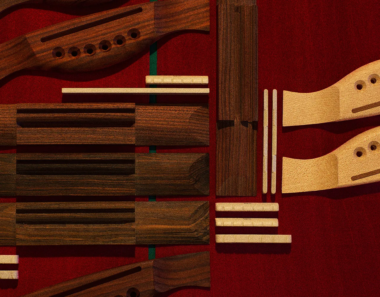
Divine Pieces
To ensure the brand became as naturally integrated as the instruments themselves, we worked closely with the entire team of artisans. We analysed the specific needs of each piece in order to apply the brand coherently and practically, achieving the perfect balance between identity and function.
As an example, the guitar’s fretboard markers aren’t just dots. They've been redesigned with a simplified version of the logo: the cross. Another example is the portable drum, where the logo is displayed on the bass drum, helping the musician to align the pedal perfectly.
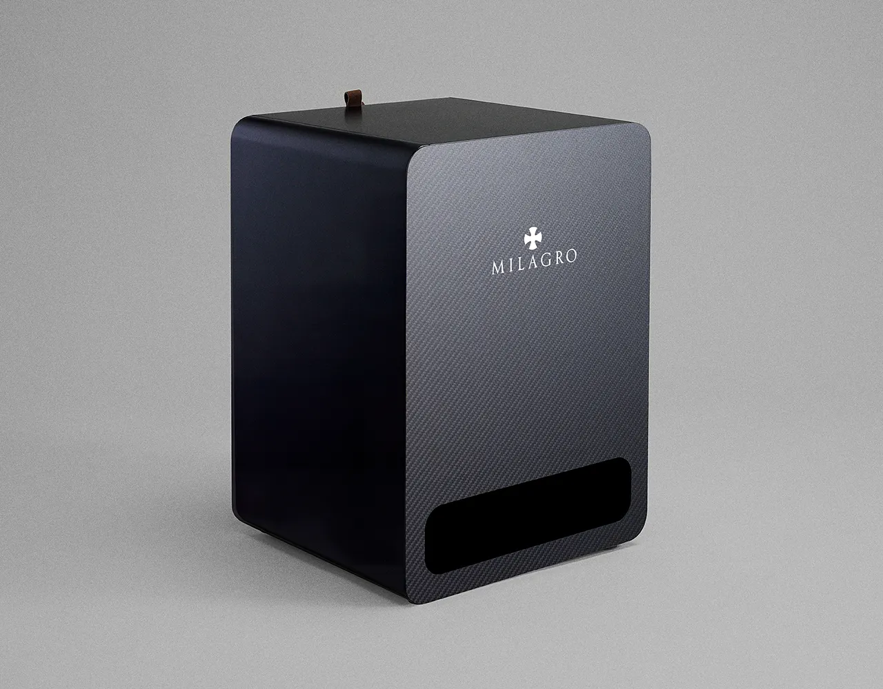
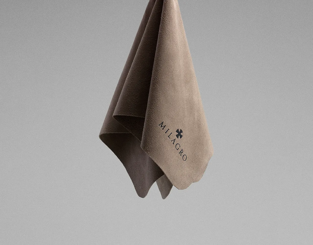
Accessories such as the strap and cleaning cloth have also been designed with the same elegance and distinctive aura that define the brand, ensuring visual consistency through every element.


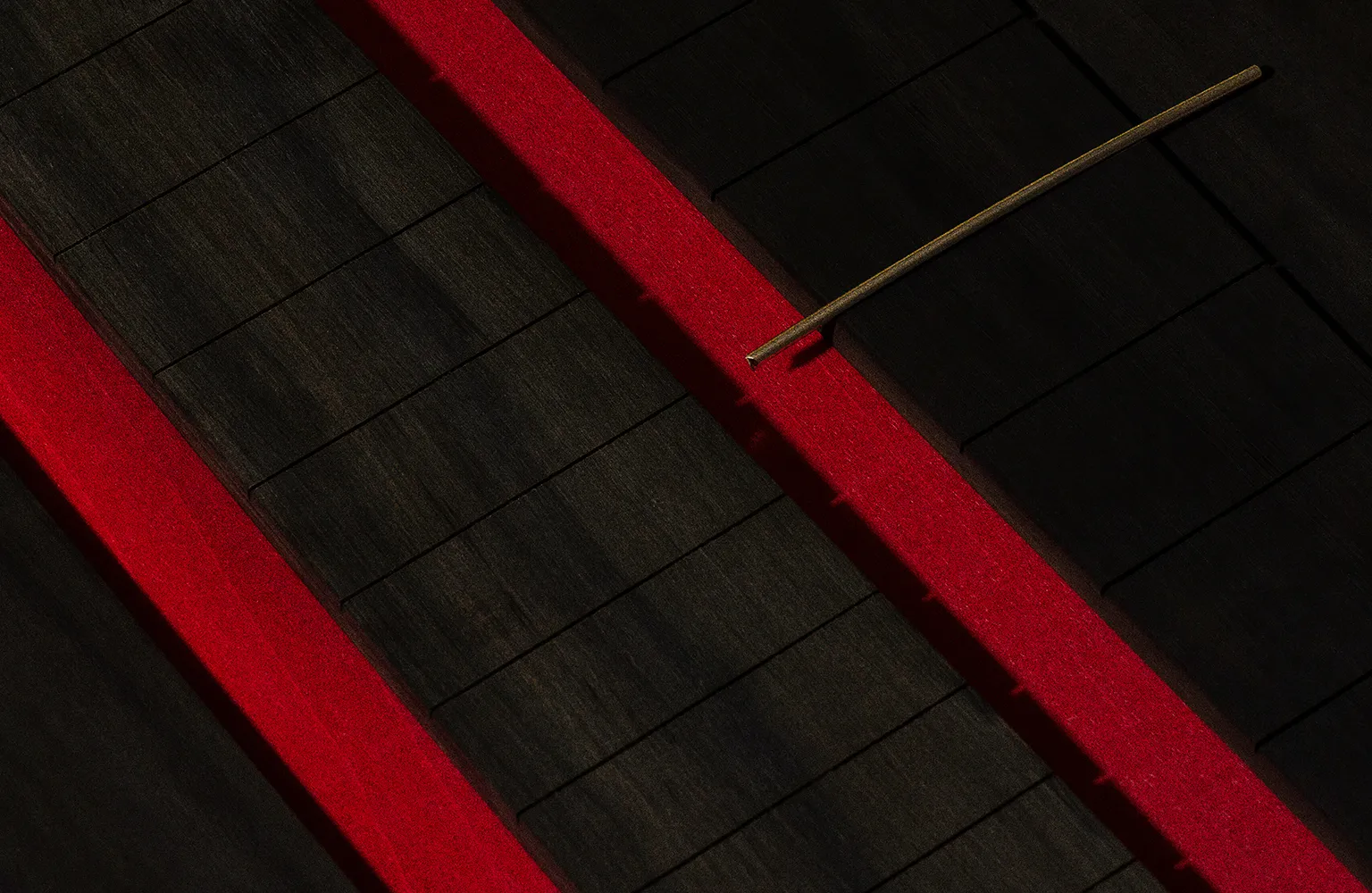
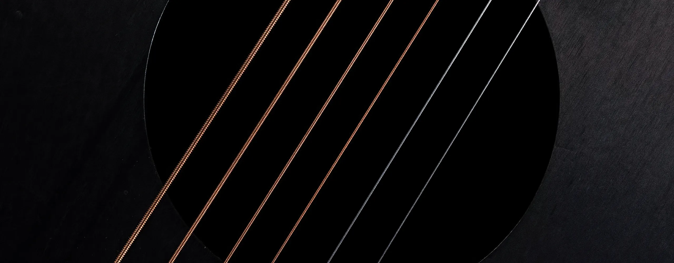
The Creative Aura
The art direction is guided by a deeply personal identity, in line with the publishing house’s overall style, but enriched with a more mystical and enigmatic feel, using elements that reveal the handcrafted process behind each piece.
The photography, carefully composed, focuses on the detail and care being given to each instrument. Light enhances textures and craftsmanship, creating an atmosphere of mystery and transcendence that elevates the perception of each piece. In this way, every image becomes a visual reflection of perfection and divine inspiration that runs throughout the entire project.