Technology
Beco
Connect to Disconnect.
Brand Strategy | Verbal Identity | Visual Identity | Digital Design | Product Design
Beco was born to use home automation systems' intelligence to optimize their response abilities. The code, internally developed, optimizes and coordinates human resources in a unique way, accelerating the automatic learning process in an innovative and effective way. As a result, Beco achieves more suitable responses and can anticipate each user's individual needs.
A clear approach to well-being and comfort through the integration of new technologies. Helping users achieve the same results with minimal effort and time investment.
Staying Tuned
Starting the market incursion required a prior exhaustive evaluation of the company, which was essential to understand the culture and philosophy of Beco. Additionally, an exhaustive long-term sector analysis was carried out, incorporating market trends and consumer insights. These elements provided the necessary keys to precisely align the brand strategy with the organization's internal culture. Therefore, it allowed us to respond to market demands effectively.
Accordingly, the new brand adopts an elegant and minimalist approach that establishes a deep connection with the user. This allows us to show a highly sophisticated vision of home automation, reflecting the technological revolution undertaken and projecting the differentiating position of Beco.


A Visual Identity to Connect
We created a logo that skilfully incorporates graphic elements established in telecommunications imagery and coherently integrates them with the brand name. To achieve effortless adaptation across varied formats, we chose modern and versatile typography.
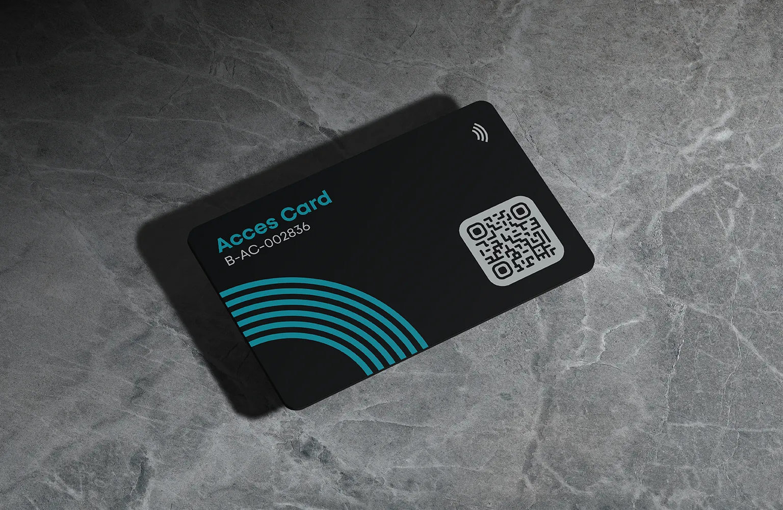
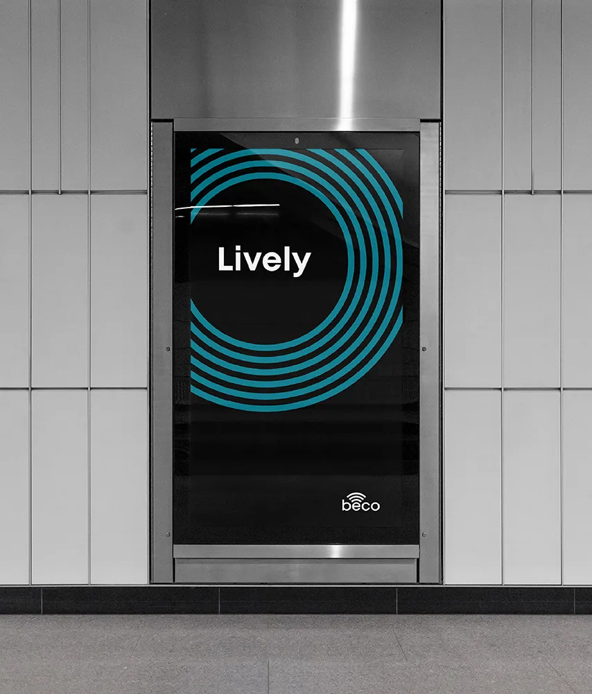
The visual system incorporates waves as a main element, symbolizing Beco's management and automation abilities in any context. At the same time, it reinforces the brand promise of offering synergies between technology and life quality by relieving users of daily tasks and enhancing personal connections. Connect to disconnect.
The colour palette consists primarily of black and light grey, providing the brand with the sophistication needed to encapsulate expertise and specialization in high-performance projects. The inclusion of dark turquoise as a secondary colour brings the visual identity closer to the technological sector, creating a noticeable contrast between primary tones.


Two-Way Connection
One of the biggest challenges of the project was the need to design a final product that not only had to respond to a technological demand, but also had to embrace the opportunity to reinforce the visual narrative in a cohesive way to achieve a tangible expression of the brand. To accomplish this, we collaborated with the internal design teams of Beco, to understand the functional and technical needs of the digital and physical product.
The digital interface combines with the most important assets of Beco, which are adapted to different functions, creating compositions and animations that facilitate its use.
Likewise, the home automation hub incorporates colours, shapes, and materials that harmonize with the brand’s visual narrative and help ensure the device's structural integrity.


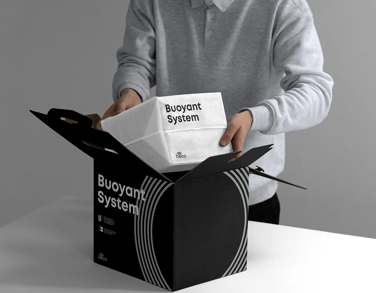


Driving Synergies
One of Beco's main objectives was ensuring stable connectivity across all areas. For this reason, the brand identity extends to and encompasses all types of corporate, commercial, and communication materials, with a dedicated art direction that carefully considers every detail and enhances quality.
The resulting consistency strengthens the links between all brand elements and helps the user build a strong and lasting brand concept, allowing him to recognise every moment when Beco is present throughout his daily life.