Essentials
Wordmark, Brandmark, Combination Mark and Emblem
Differences Between Brand Identity Design Types.
Branding | Strategy | Design
| Written by Adrián Sánchez | Reading time 5 minutes
The word “logo” is commonly used to describe the graphic representation of brands such as Netflix, Apple, YouTube, or UPS. However, while all of these are leaders in their respective sectors and part of our daily lives, each employs a distinct visual concept, for this reason we should not group them under a single term.
Wordmark, brandmark, combination mark and emblem are not the same, and understanding their differences is key to managing your visual identity effectively. A brand may combine typography, colour, and symbols depending mostly on its purpose and the formats in which it will appear, this defines the most suitable type of graphic representation. Below, we’ll explore each concept to help you better understand their function and relevance in brand building.

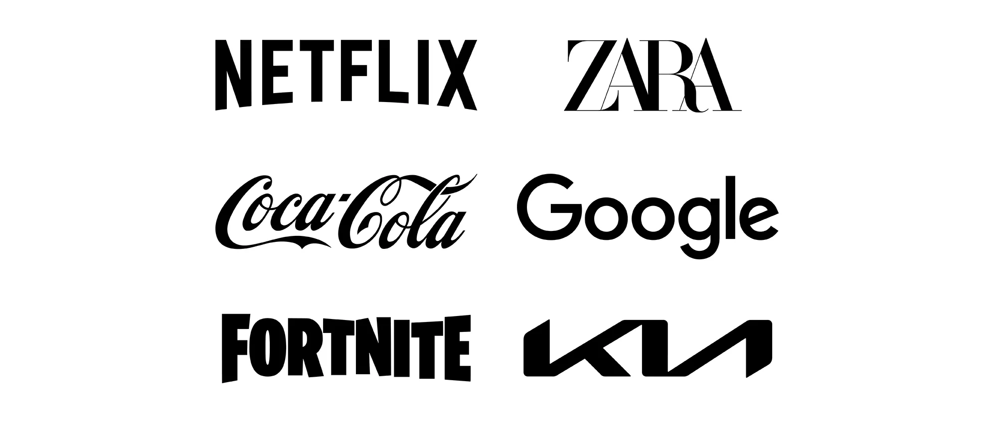
What is a Wordmark?
The term wordmark refers to the graphic representation of a brand composed entirely of letters, words, acronyms, or signatures, without any visual elements. In this type of identity, legibility and the rhythm of the word’s pronunciation play an essential role in ensuring the brand’s recognition and success.
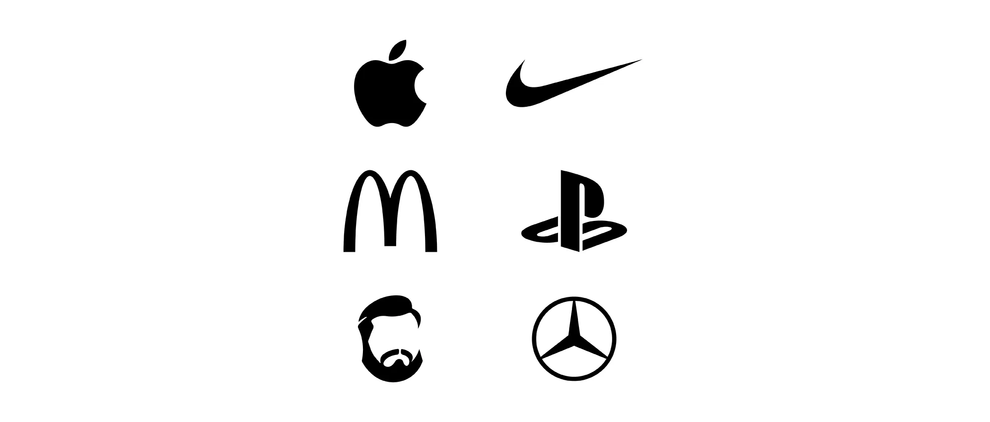
What is a Brandmark?
A brandmark is the graphic representation of a brand made up entirely of visual elements, with no added text to allow us to read it. The symbol is so recognisable that it doesn’t require words to be understood, conveying the brand’s identity and values in a powerful and independent way.
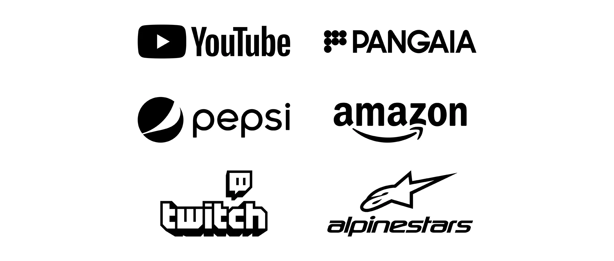
What is a Combination Mark?
When both text and visual elements are used together to create a graphic representation, the result is known as a combination mark. In this fusion, both components are not fully integrated, allowing them to work independently if needed. This feature provides versatility and, in many cases, helps with the creation of sub-brands or adaptations.
What is an Emblem?
A full integration of text and visual elements, creating an indivisible brand representation, is known as an emblem. In this case, all components complement each other and lose meaning if they are used independently, creating a strong and cohesive identity in which each element reinforces the overall message.

How to decide between a Wordmark, Brandmark, Combination Mark and Emblem?
Whether a visual identity includes text, visual elements, or a combination of both is a tactical decision that must be motivated by strategic reasoning. For this reason, it is essential to consider the brand’s circumstances and application contexts in order to choose the graphic typology that best suits its needs.
When the priority is ensuring that the brand’s name is remembered, the use of the wordmark becomes particularly relevant. In such cases, avoiding visual elements allows full focus on the text part, enhancing the name’s memorability and strengthening the brand’s recall.
A brand identity based only on a brandmark should be reserved for brands with high public exposure and a long-term positioning strategy. This approach requires time, consistency, and strong recognition in order to the symbol can represent effectively the brand on its own.
If the brand must appear in both large formats and in very small spaces, such as products or apps, a combination mark is essential. In these cases, the text is assisted with visual elements that can be separated, allowing the brand to adapt well through different sizes and media.
To distinguish a brand from a distance or in fast-moving situations, such as on dynamic media or vehicles, an emblem is the most effective option. By integrating text and visuals that always work together, the brand becomes instantly recognisable and easily readable, ensuring its impact.
It is worth remembering that a brand may have diverse needs that call for different graphic versions depending on the situation. Therefore, it is crucial to rely on Branding professionals who can identify and organise these versions according to priority, establishing primary and secondary variants to maximise business impact and benefit.